Remember I said I had an idea for a card the other day? Well here it is, and I thought why not show you what I did to achieve it step by step?


I knew when I had the idea for this card, it would not be an
easy project but I like to challenge myself (either that or drive myself crazy
;) ) I wanted to see if I could make
it. I’ve never made a card like this
before and it is always good to try something new when crafting. The beauty about this card is you do not have to use an ornate frame like I have done, you could just as easily use a plain oval, circle or rectangular die and still get a lovely card. (I may try that too myself in the future!) Imagine what the front could look like with some patterned card, embossed by a folder, with a shape cut out of the middle, it would look wonderful I think.
For this projected I used:
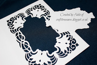
Spellbinder's Cascading Grace die set
The Sheena Douglass A little bit Floral Iris stamp set
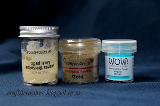
Jet Black Stazon Ink
Versa Mark Ink pad and pen
Embossing powders
Crafter's Companion Aquablend pencils
Distress Inks, Tea Dye and Walnut Stain.
White card
Glue and foam tape.
Ranger Glossy Accents, clear dimension medium.
1. I took a 5x7" card and placed the Spellbinders Cascading Grace die in the centre of the front panel. I have used this die many times before, although on this occasion, I was cutting into the card, rather than out of it. I taped it with low tack tape to keep it in place and ran it through the machine.

2. Crafty tip. If you have problems embossing part of the die because you are unable to twizzle it round on the cutting plate of your die machine, you can take a cotton bud and gentle rub it into the grooves of the embossed section.

3. I cut out the centre panel to create the frame.

4. The tag was kept to use later.

5. I selected my choice of embossing powders to create a shabby chic/speckled finish.

6. I then also cut the frame into an A4 piece of white card. The card, being bigger, would allow me wiggle room to line up the ornate frame back to back.

7. Once I had lined up the frame, wrong sides together, as you would do with sewing, (this took time,) I carefully glued each section to make sure it met at each point. Then I cut the centre tag out and trimmed the excess card around the edge. Now it gave me a stronger card, as the front had been weakened by cutting the frame and it also gave it a cleaner professional look on the inside. It was now a double thickness card as it were.

8. So then I ended up with this.

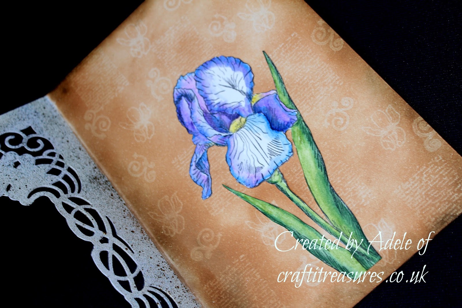
9. Now I moved on to decorating the inside of the card. I used Versa Mark ink to randomly stamp small vintage text, the tiny Iris from the Sheena Stamp and a swirl from another stamp set. Versa Mark allows you to create a watermark effect. Over the top of this, I used Tea Dye Distress Ink and Walnut Stain Distress Ink around the edges. It left the stamped images white on the background as Versa Mark resists the coloured ink. I then sprinkled embossing powders on the inside frame too, to match the outside.

10. I stamped the Iris twice with Jet black Stazon (as I was using watercolours) and it is a solvent ink, once, as a base which you can see I started to colour, and second time to cut pieces out of it. I then stamped it a third time to illustrate which sections I was going to cut out in red, so you could see the elements I would be using the layer up.
The Pigment is strong in the Aquablend pencils, so a little goes along way. I did not colour all of the main petals on the base flower, only the edges, as I would be layering on top of this anyway. The edges do need to be coloured though as I didn't want any white coming through, from underneath the layers, when I built upon the image.
Crafty tip: Stazon will stain your stamps as it does what it says on the tin. To stop this, you can ink your stamp up with Versa Mark first, leave it a few moments and then ink your stamp up with Stazon over the top. Then stamp your image, as soon as you have done this, clean your stamp with a baby wipe and you should find it has not stained it.
Another Crafty tip: if you are using a waterbased Memento Ink and you find that it pools on some of your clear polymer stamps. Ink these up with Versa Mark too before over inking it with Memento.

11. I then worked out where to position the base Iris inside the card, the layered petals did not want to be catching on the outer frame.

12. I glued the Iris flat to the inside of the card. The reason I choose Tea Dye Distress Ink as a background, was because I wanted it to be a contrast to the colour I had chosen for the flower, this would make it stand out more and also add to the vintage theme. Crafty tip about choosing colours coming up at the end of this blog.
13. I took the two petals I was going to layer up. I always add a blob of glue underneath foam tape to make sure it will not come off later. I also put some glue around the edges of the petals so I could curve them, and stick the ends down, this meant they would be graduated and coming towards you.

14. I took the Iris sentiment from the Sheena stamp set and printed it on to a long strip of card that I had distress again with Tea Dye. Both ends were then rolled to turn it into a scroll/banner. I ran a Versa Mark pen over the edge of this and embossed it with gold powder.

15. Usually when I make a banner like this, I curve it and place a piece of foam tape in the centre on the reverse, whilst gluing the flat sides of the roll. On this occasion, I could not do this as it was being attached to an open frame, so I simply curved it and glued either end of the rolls to the card front.

16. Finishing touches are all about the detail. (I do love detail, have you noticed? ;) ) I added little white spots in the centre, spilling out on to the lip, for a realistic interpretation. I also decided to add little drops of Glossy Accents, to mimic water droplets.

17. I added some complimentary blue pearls on the corners of the frame as this would draw the blue colour through and towards the Iris. (They are darker but look paler in the photograph.)

18. The tag I cut out from the centre was used on the back, this gives someone a place to write a message. I decorated the back the same as the front with the embossing powders. The with love always is a Sheena sentiment and I also stamped the small Iris and leaves from the set, cut these out, coloured them and glued them flat to the bottom of the tag.

Tah dah! Finished. :)
I hope you have enjoyed this project and seeing my thought processes (scary isn't it?) There is method in my madness, well that is my story and I am sticking with it.
And lastly here is a tip about colours, this came about from talking to a lady yesterday who said she has "got in to adult colouring," which is a wonderful hobby. She enjoys it but confessed that she doesn't always feel confident about using colours though, which ones to put together, or if they will look right. So I shared a tip with her and after talking to Sheila later about crafting, (she can't help it now), she said it would be a helpful tip on my blog
Crafty Tip: This began as a little tip and then became something else entirely. Bare with, as Sheila said I was aiming for a side order not a main meal, "Here's something to get your teeth into," although I almost ended up gritting my teeth as this explanation turned out to be more complicated than anticipated. Why, I hear you ask? Because it seems that since my art training (and Sheila's) the terminology has changed. I'm of the opinion if something isn't broken you don't need to fix it, it's like Starburst and Snickers all over again, I am sure there is a boffin somewhere who is to blame! lol
In the good old days, (before chaos descended) we were taught that contrasting colours were those opposite on the colour wheel (red and green) and complementary were those close to each other in hue. Apparently these are now called Analogous colours, ( your teeth may fall out trying to say that word, ours nearly did.)
So to recap, contrasting is now known as complimentary
And complimentary is now analogous
so it seems.
Anyhue, (see what I did there?) as I was going to say before my brain melted...
If you feel afraid of using colour and are not sure what to put with what, this is a useful tip. This is what I have learnt. I see shades not colours, some people who are creative naturally do this, it is innate for them, for others it may come through art training, whichever way it is a good thing to have. Consider it a crafting app! :) lol
If you are wanting to choose colours but are not sure if they will go together why not try this technique? Is the first colour you have chosen cool (soft) or warm (strong)? If you have chosen a warm yellow or orange and need a contrasting colour (sorry, complementary), to make them stand out, you would need to choose a warm purple or blue. This is what I did with this Iris Card, (So I thought it would be the perfect time to mention colours.)
Analogous colours
These are colours that are next to each other on the colour wheel and they harmonize well because their hues are only slightly different.
Complementary Colours
Are opposite each other on the colour wheel, the best example of this is red and green, (which is popular at Christmas), purple and yellow and orange and blue, (put simply)
Basically, if the colour saturation is equal in all colours, they are all warm (strong) or all cool (soft) you can't go wrong. Also, there is a degree of personal taste, experiment, sometimes you can break the rules, apparently I have done this with my Iris card as this colour scheme is actually classed as 'analogous complement.' Well, that's me being a bit random again, but it worked didn't it?

My advice, don't ever google the subject because you will pickle your brains as there is so much out there, some of it is complicated and some of it simple (lol). I found these are probably the best links if you wish to look into it deeper. I hope I helped...or shall I just get my coat?..
Adele
x
Oooh I like this a lot :-) Beautifully coloured iris and fabulous frame. Love that you made a tutorial xxx
ReplyDeleteThank you :) That means a lot. :D I enjoyed making this card. xxx
Delete